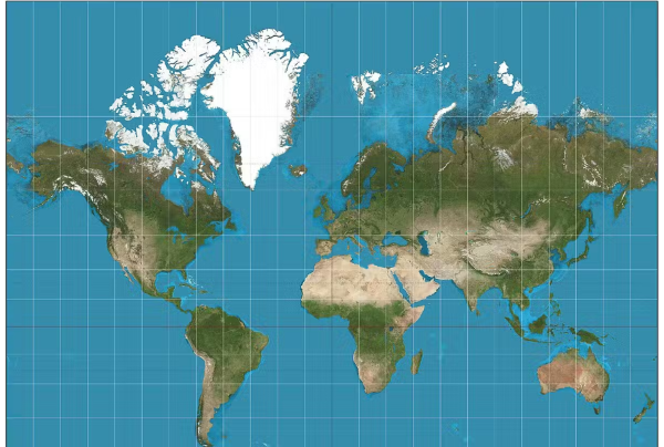
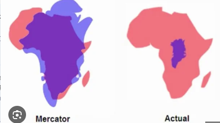
Size and location matter. Or rather, the perception of size and the perception of the value of location matter. Most of us grew up using the Mercator projection of the world onto a 2d surface (shown in the image). And perhaps until recently, we weren’t aware of how widely distorted this view is. It inflates the size of land masses closer to the poles and under-represents the size of the vast middle by a lot.
Does it matter? The African Union thinks it does. They are working to get the United Nations and the global community to use a different kind of world map that more accurately portrays relative size.
How wrong is it? And how important is it?
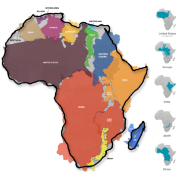
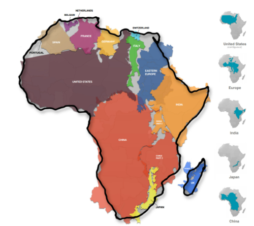
Take a look at Africa on the Mercator projection. It looks similar in size to the United States. Now look at the continent of Africa with seemingly equally large countries all nestled inside it. Such a dramatic difference does shape how we think about relative importance.
Another case in point that is particularly relevant today. Look at Greenland on the Mercator projection versus its actual size. In reality, Africa is 14 times bigger than Greenland. And maybe Greenland isn’t quite so big a trophy.
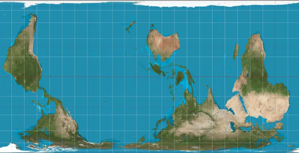
And what about location? We’re accustomed to looking at a map where north is up and the Atlantic Ocean is the center with North America and Europe as the bookends. And in your mind, do north and up somehow seem more important and valuable than south and down? And what if we centered the map around the Pacific Ocean instead, highlighting the value of Asia?
As you look as this “upside down” and differently centered map, it feels wrong and uncomfortable, doesn’t it? You begin to understand how much our perceptions are shaped by the Mercator projection.
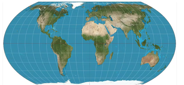
What’s the solution? The African Union is proposing use of something called the Equal Earth Projection. You can see from the image that the relative sizes of the continents look very different (and closer to reality). The African Union feels that a change in the maps we use is an important step in changing our perception of the value and importance of Africa.
You can read more about maps and this imitative here: World maps get Africa’s size wrong: cartographers explain why fixing it matters. And for a fun look at altering the way you think about north / south, up / down, east / west, check out this article: This article will literally turn your world upside down